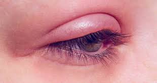
BE CAREFUL! COLOR AND FONT CHOICE COULD HURT YOUR EYES
We’ve said it before; but the human eye is an amazing machine! Through tiny cells called cones, our eyes are able to see about 10 million different colors. But not all colors are created equal, and some are just too difficult to look at as they can cause headaches, high blood pressure, and eye strain. With the increase in time spent in front of our digital devices – six to nine hours per day on average – the colors and even the fonts we stare at on our digital screens can become sights for sore eyes.
The Impact of Color and Fonts on the Eyes
Bright colors in particular can be harsh on our eyes – but they also draw our attention. Think about the color yellow. In lighter shades, yellow is comforting and cheerful. But when the brightness is cranked up, yellow can be a stimulant on the eyes. Studies show that babies cry more often in yellow rooms and couples tend to fight more in rooms with yellow paint. However, given its ranking as the most visible of all the colors, yellow is a great color to use when you need to grab attention. This explains the use of bright yellow on warning signs.
Different fonts can play tricks on our eyes too. Even though Times New Roman is a common default font in many computer programs, this font can actually hurt your eyes. The tiny tails on the end of each letter, called serifs, will force you to stare longer in order to recognize a word. This can lead to eye fatigue. Luckily there are fonts, such as Arial and Verdana, without serifs (sans-serifs), that have more space between each letter and are easier to read from farther away.
How to Stop Eye Strain from Harsh Colors and Fonts
It’s recommended that we stretch before a work-out to ensure we don’t strain our muscles, but have you stopped to think about the strain you put on youreye muscles everyday as you stare at your computer, television, phone, and other devices? You’ve most likely felt the effects of digital eye strain and computer vision syndrome – headaches, dryeyes, blurred vision, or even a sore neck – but what can you do to stop this pain? An easy way to combat eye strain is to simply adjust a few settings on your computer:
- Change the brightness setting – Match the brightness of your monitor to your surrounding workstation. To test this, look at the white background of this webpage. If it looks like a light source, your monitor is too bright. On the other hand, if it seems dull and gray, it may be too dark.
- Adjust text size and contrast – Text should be three times the smallest size you can read from a normal viewing position, which is about 20-30 inches from your monitor. As for contrast, black print on a white background is usually the best combination for comfortable reading.
- Stick with sans-serif fonts – As mentioned earlier, fonts without serifs, such as Arial, are much easier on the eyes.
- Increase browser display size – With the increase in wide-screen computer displays, websites are often shown as a column with empty margins. To increase the webpage so it fits your monitor, hold down the Control key and scroll up with your mouse. If you have a Mac, increase the browser window by pressing Command and + until you reach the size that looks best for you.


